
Case study
Accessible Customer Service Platform
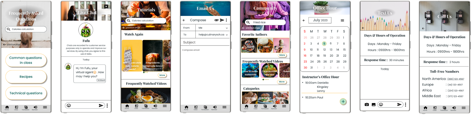
Online cooking classes are fun until something goes wrong mid-recipe.
A student burns the sauce, misses a step, cannot understand an instruction, or needs help quickly. Waiting too long for support can turn a learning moment into frustration.
I designed a support platform that helps students get the right help at the right time, in the way that works best for them.
Product problem
The existing support experience needed to serve different needs, learning styles, and urgency levels.
- Limited support methods
- Long wait time for help
- Text-heavy self-service content
- Accessibility gaps for users with disability
- Lack of a unified support experience
Design goal
A support platform that feels clear, accessible, and flexible.
The design goal was to create a unified support experience that helps users find the right help quickly, whether they prefer self-service, guided support, or direct human assistance.
- Not every user wants to call.
- Not every issue needs live chat.
- Not every answer should be buried in a giant FAQ wall of doom.
The platform needed to let users choose.
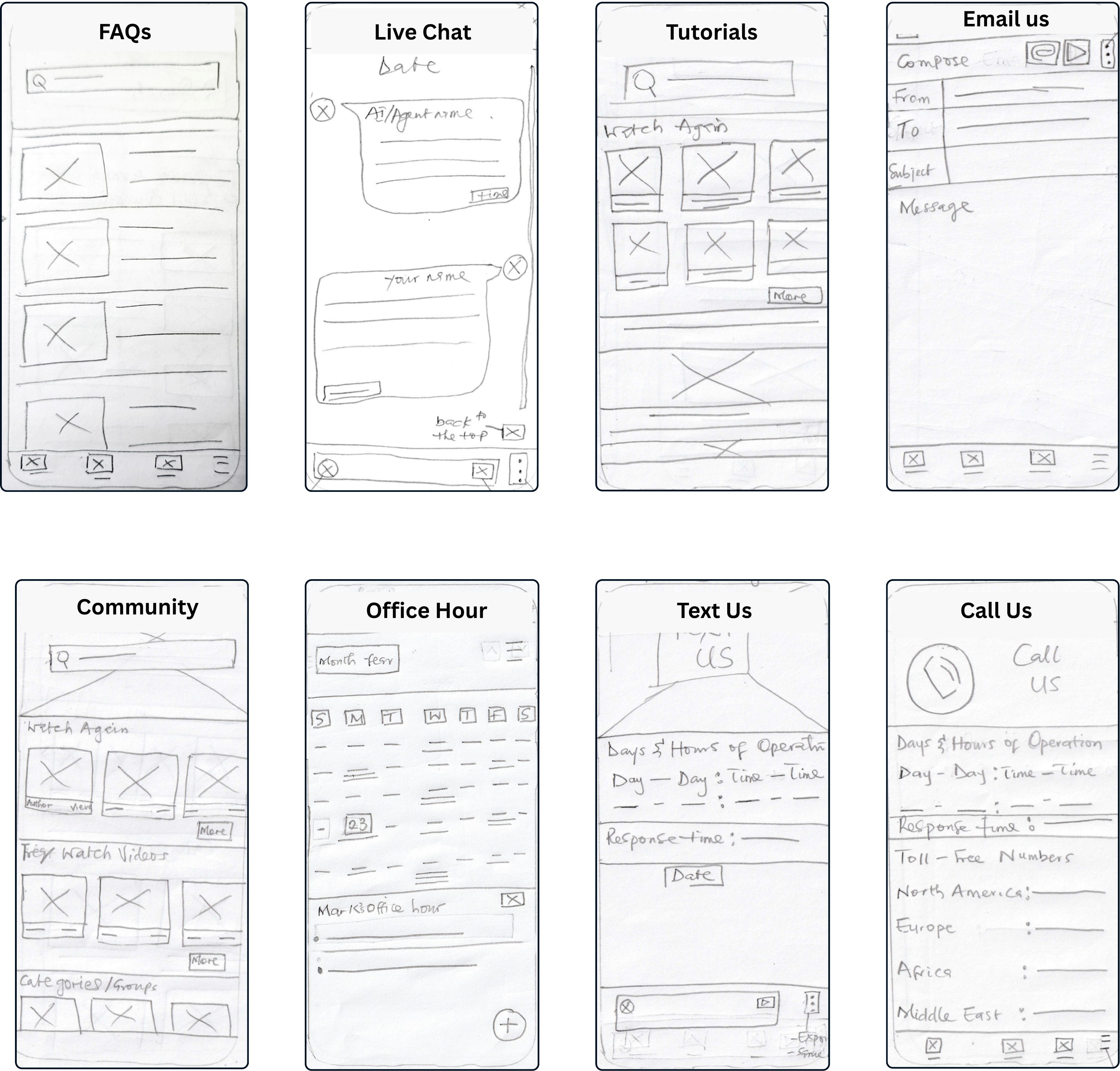
By giving users eight connected resolution tools, the platform reduced support friction, improved confidence, and made help feel easier to find, understand, and use.
System strategy
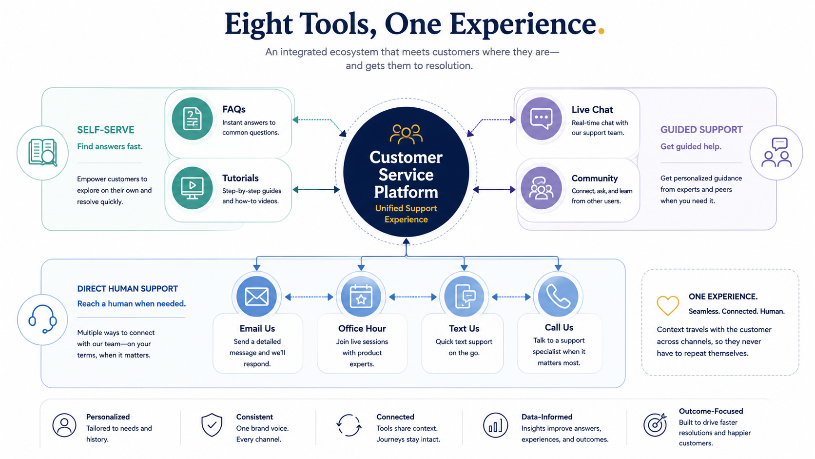
Eight tools, one connected experience.
Instead of treating each support option as a separate feature, I designed the platform as a service ecosystem.
Key design decisions
Designing for choice, clarity, and confidence.
- Start with self-service, but make escalation easy: Users could begin with FAQs or Tutorials, but move to Live Chat or another support method when needed. This helped balance user independence with human support.
- Make accessibility visible and useful: The experience included accessibility considerations such as readable typography, strong contrast, icon explanations, narrator support, translation, and voice-to-text support. Accessibility was not treated as an extra layer. It was built into the experience.
- Reduce cognitive load: Because the platform supported users with disability, I focused on clear labels, short descriptions, visual hierarchy, and simple navigation.
Usability testing
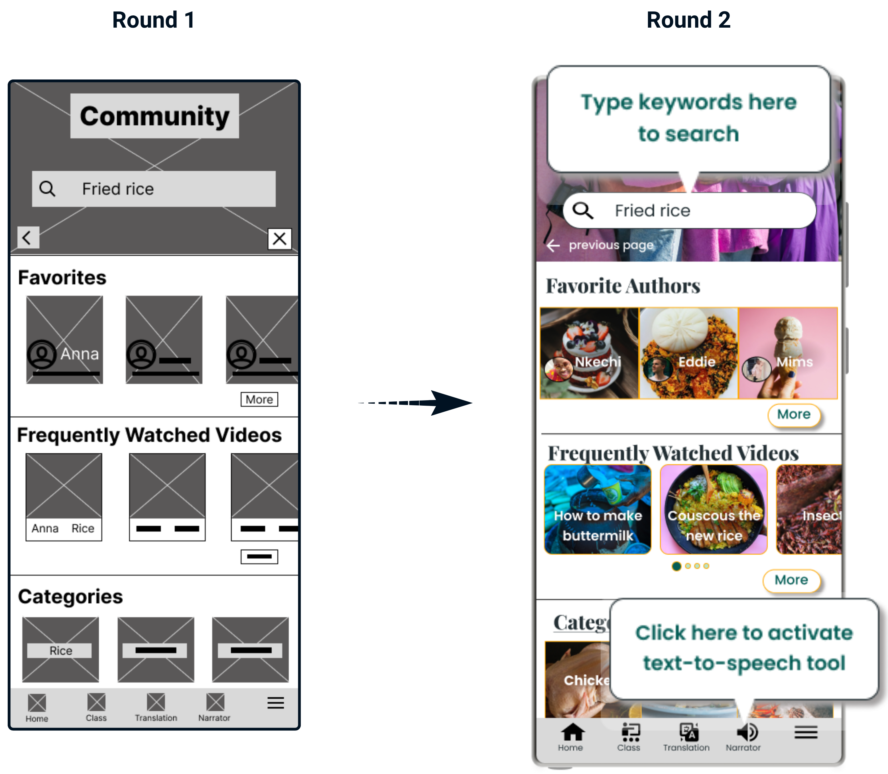
Two rounds of testing moved the design from structure to clarity.
Round 1 focused on structure, primary user flow, and whether users understood the support options.
- Users wanted concise feature descriptions.
- Users wanted control over escalation.
- FAQs needed a more intuitive layout.
Round 2 focused on high-fidelity mockups and visual refinement.
- Users needed clearer icon explanations.
- Users needed stronger text-image contrast improvement.
- Horizontal scrolling needed more visible cues.
Impact
Good support design says: you are not stuck. Here are your options.
Customer service design is not just about answering questions. It is about reducing panic. The platform gave users choice, clarity, and confidence.
This project showed how accessibility, customer service, and product design can work together to create a more inclusive support experience.
A usability participant shared:
"I really like the app because it is easy to use, the visuals are appealing, the buttons and features are easy to find and quick to understand."