Case study
FACEYOUTH Charity Website Redesign
For a charity, a website is a trust builder, mission storyteller, donation pathway, volunteer invitation, and sometimes the first place someone decides, 'I want to help'.
I redesigned the FACEYOUTH charity website to help the organization communicate its mission more clearly, reach more beneficiaries, and create a more accessible and engaging digital experience.
The problem
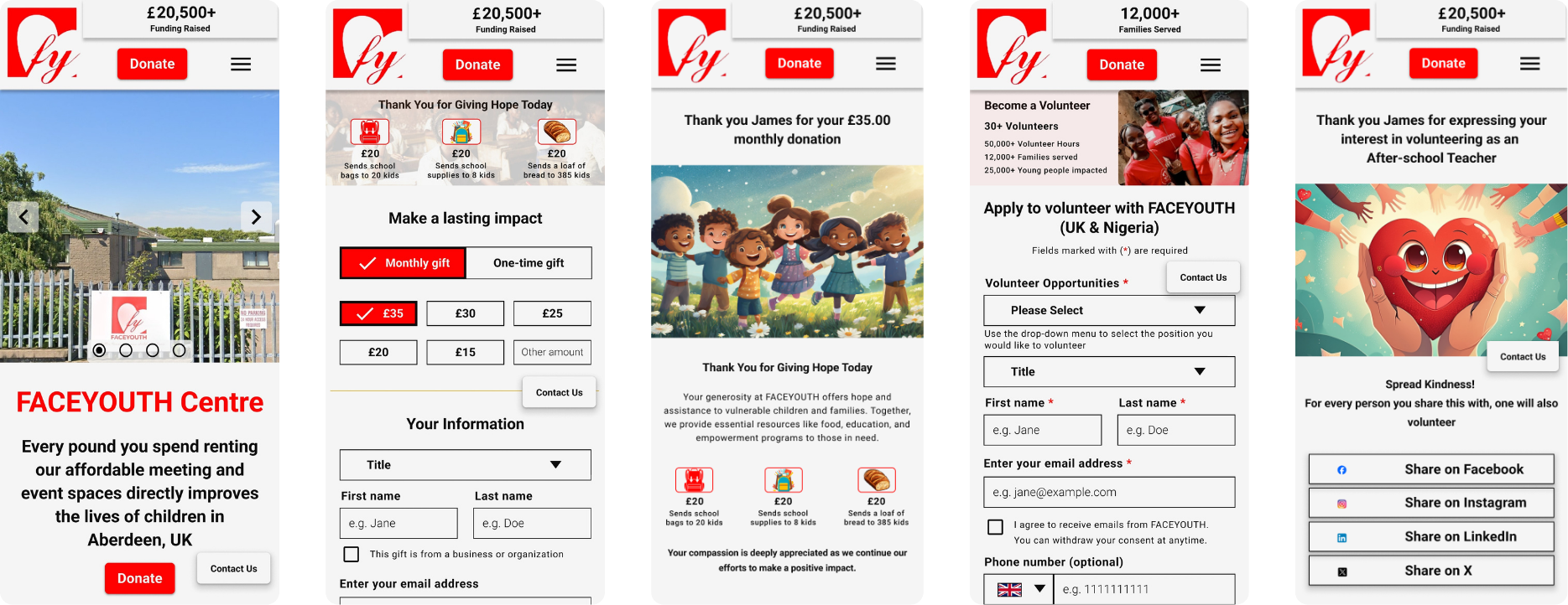
FACEYOUTH website needed a clearer mission story and stronger paths to action.
- Mission and programs needed clearer presentation.
- Donation and volunteer pathways needed stronger visibility.
- The site needed a modern, accessible, trustworthy experience.
- Multiple audiences needed to understand where to go next.
Redesign strategy
Designing the Moments That Move People.
For the redesign, I focused on four high-value areas:
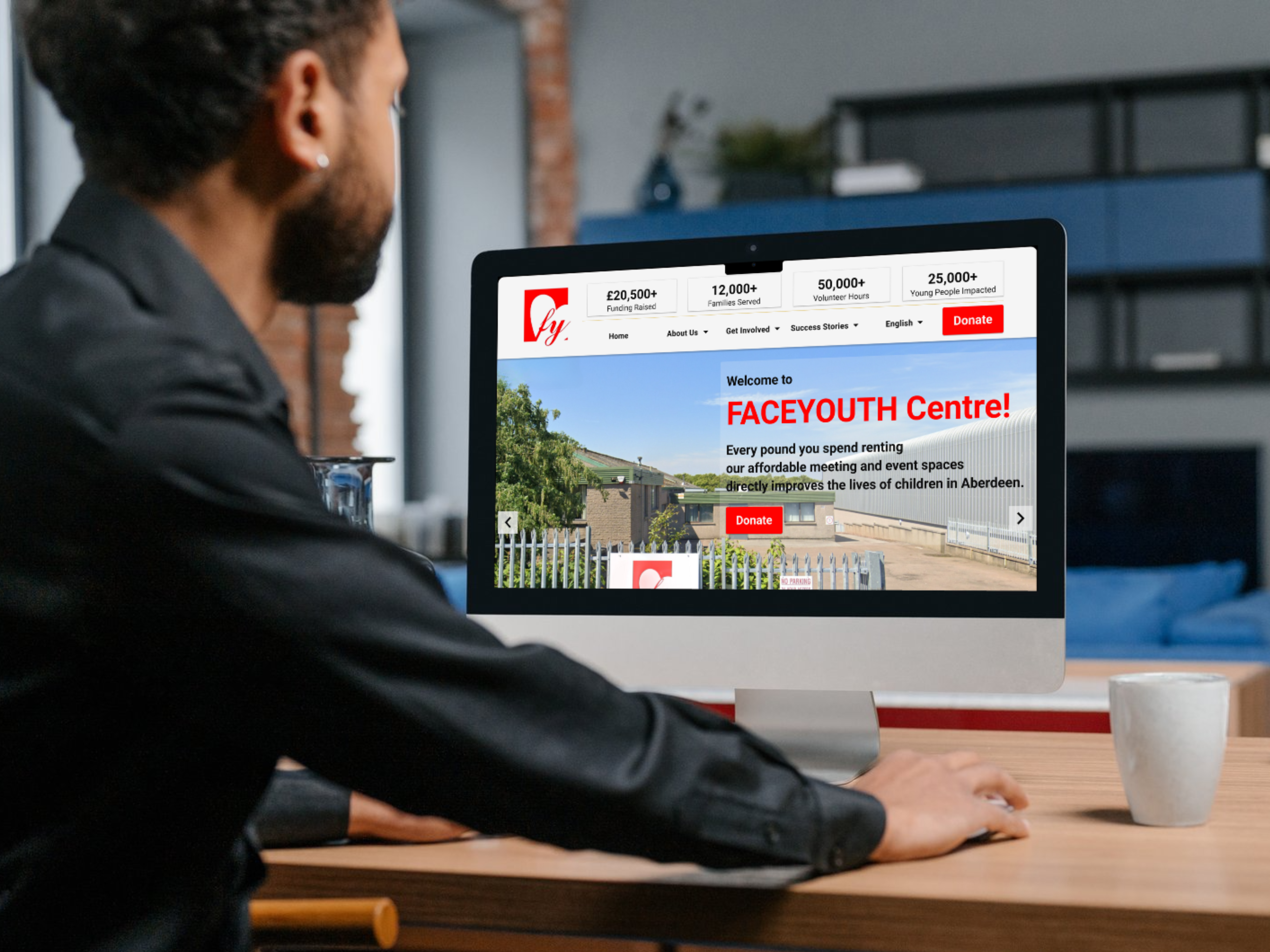
Header and navigation
Homepage
Donation page
Volunteer page
These areas shaped the most important parts of the experience: first impression, trust, action, and engagement.
The goal was to make every key path feel clearer, more welcoming, and easier to act on, whether someone wanted to learn, donate, volunteer, or connect with FACEYOUTH’s mission.
Header & Navigation
The navigation needed to make key actions easier to find.
Problem: Visitors needed a simpler way to understand where to go and how to take action.
Design direction: I created a clearer navigation system with stronger visibility for actions like donating and volunteering.
Why it matters: Good navigation does not just move people around a website. It tells them what the organization values.
Homepage
Turning the homepage into a mission-first action path.
Problem: The homepage needed to explain FACEYOUTH’s mission quickly while guiding different visitors to the right next step.
Design direction: I structured the homepage around mission, programs, impact, and calls to action so visitors could quickly understand what FACEYOUTH does and where to go next.
Why it matters:
- The homepage had to do more than look welcoming. It needed to help visitors understand the mission, feel the impact, and know exactly how to get involved.
- The goal was to move visitors from “What does FACEYOUTH do?” to “How can I help or benefit from this?”
Donation Page
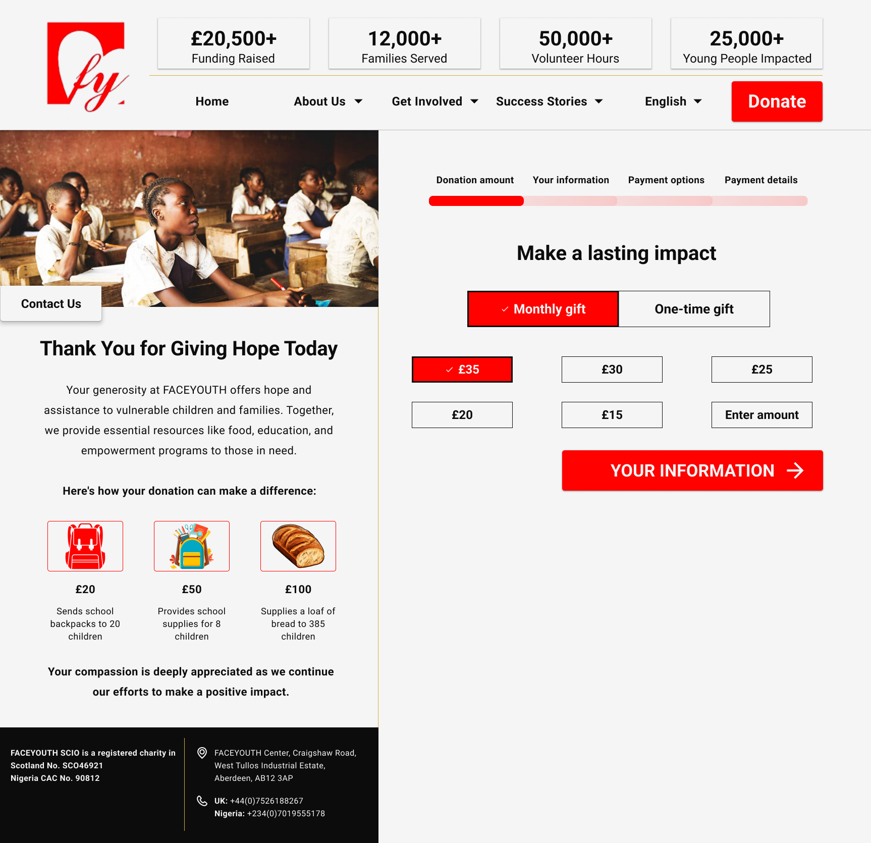
Making generosity feel simple, clear, and trustworthy.
Problem: Donors need clarity and trust before giving.
Design direction: I simplified the donation path and focused the page around impact-driven messaging so donors could understand the value of giving and act without unnecessary friction.
Why it matters:
- A donation page should not make people work hard to be generous. It should make the value of giving clear, reduce hesitation, and help donors feel confident about their contribution.
- Every design choice focused on reducing friction while strengthening trust.
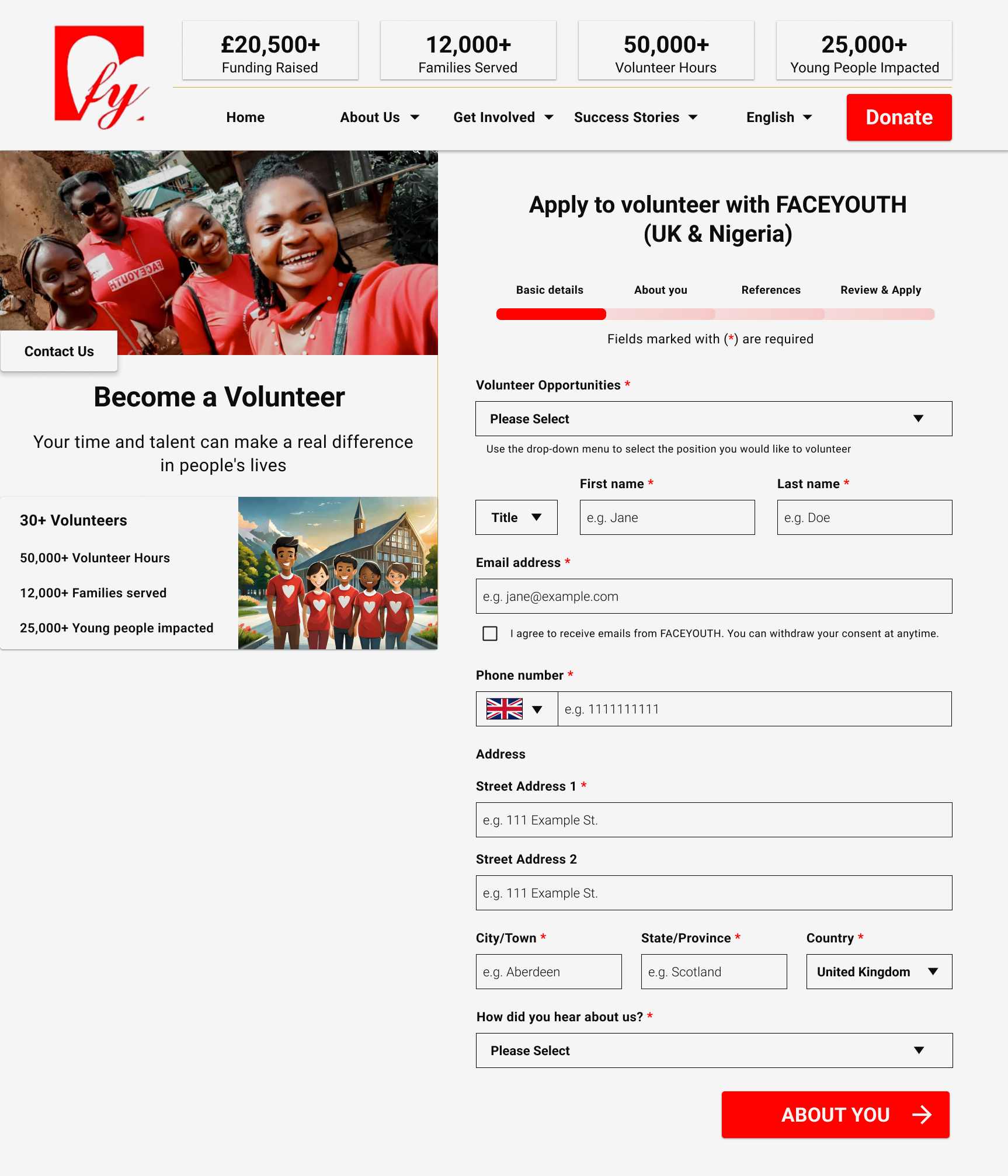
Volunteer Page
Potential volunteers needed clarity, motivation, and a simple next step.
Problem: Volunteers needed to understand how they could help and what to do next.
Design direction: I created a clearer volunteer page with role clarity, motivational content, and a simple path to sign up.
Why it matters:
- People are more likely to volunteer when the experience feels clear, welcoming, and meaningful.
- The page needed to turn good intentions into confident action.
Reflection
Charity website design must balance clarity and emotion.
People need to understand the mission.
But they also need to feel why it matters.
When both work together, a website becomes more than a place to read. It becomes a place to act.
The redesigned website created a stronger digital presence for FACEYOUTH.
It improved how the organization communicates its mission, presents programs, invites support, and connects with beneficiaries, donors, volunteers, and partners.